
IELTS WT1 (Pie Chart)
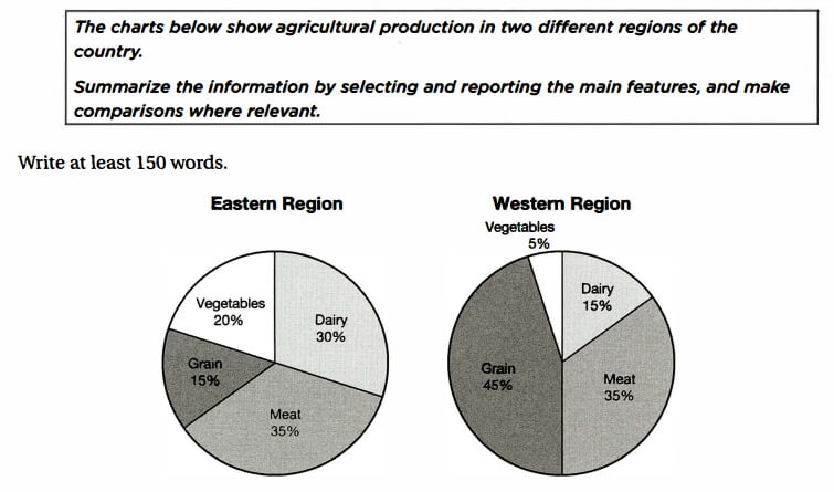
The supplied graphs delineate the percental data on vegetables, meat, grain and dairy production in country’s Western and Eastern regions.
Overall, it is worth mentioning that grain is a leading product in Western area, despite the fact that it is a minor producing group in the Eastern region. The figure of meat production in both regions states a significant part of agricultural production, and the East produces dairy as twice as the West.
Now, turning to the details, Eastern region’s main agricultural product is meat, which makes up a 35% of the graph. The next biggest group are dairy products that account for 30%. Production of vegetables and grain is relatively low with proportions of 20% and 15% respectively.
In Western area, however, the production of grain alone constitutes almost a half of all agricultural products — 45%. The figure of meat products is 35% — exactly the same amount as in the other region. The proportion of Western dairy production makes up only a half of East’s proportion — 15%. West’s least produced products are vegetables that account for 5% of all graph.
by Zhanel Dorzhigulova
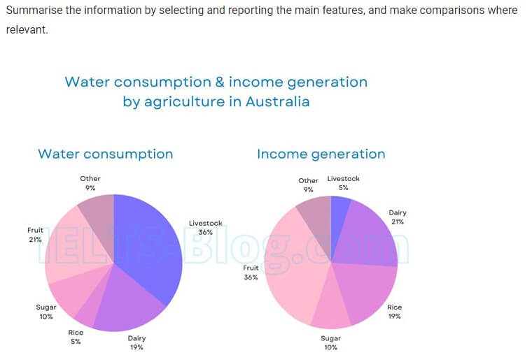
The two pie charts display a water usage in Australia divided by agricultural food sectors in 2014 and profit they make.
Overall, livestock consumed the biggest amount of water in 2014, whereas the income it generated was the smallest. Fruit and dairy showed a significant amount of water consumption after livestock where fruit produced more income and dairy had similar percent as water consumption.
In 2014 livestock sector had just over a third per cent of water consumption. The next biggest sectors were fruit and dairy: 21 and 19 % respectively. Sugar consumed 10% of water and other sector had almost the same figure, which is 9%. The smallest percentage of water consumption was rice with 5%.
Fruit sector provided the highest income from all agricultural products with 36 per cent. Dairy and rice showed similar figures: 21 and 19% accordingly. Sugar and other products generate the same amount of income as they consume water. The least amount of money produces livestock, which is 5%.
by Daniya Bekentaeva
The pie charts below show the comparison of different kinds of energy production of France in two years.
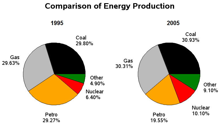
The graphs display the contrast in the generation of various energy types in France within 1995 and 2005.
Overall, the highest proportion of energy were produced by coal and gas, remaining were stable in both given years. Petrol energy production declined in 10 years, whereas there was a rise in the nuclear and other kinds of energy generation.
In 1995, coal and gas energy were the most produced energy types and they also represented the largest proportion of the pie chart after 10 years, having around 30 per cent each in the two given times.
Petrol energy as the third most generated energy in 1995, with approximately one-third of its production, dropped to around 20 per cent being at the third place as well. In both years, atomic and other sorts, which were in the list of least manufactured energy, at 6.40% and 4.90% respectively, experienced an increase, having the percentages of 10.10% and 9.10% accordingly.
by Gulmira Kinzhekeyeva
The pie chart illustrates the proportion of various types of farming production in Eastern and Western region of the country.
Overall, Eastern region produces more vegetables and dairy, while the Western region grows significantly more grains. Both countries produce the same volume of meat.
It can be clearly seen from the bar chart, grain farming is the most significant branch of the agriculture of the Western Region – it constitutes almost a half (45%) of the total. Another half of production is divided between dairy (15%) and meat (35%). The number of vegetables growth is negligible and makes only one-twentieth of the total.
According to the data given, East is specialized in livestock farming: meat and dairy together make 65% of the agriculture production of the Eastern Region. This area produces considerably more vegetables, which is one-fifth of the total and fewer grains (15%). The proportion of meat is the same as the Western region (35%).
by Alesia Leschinskaya
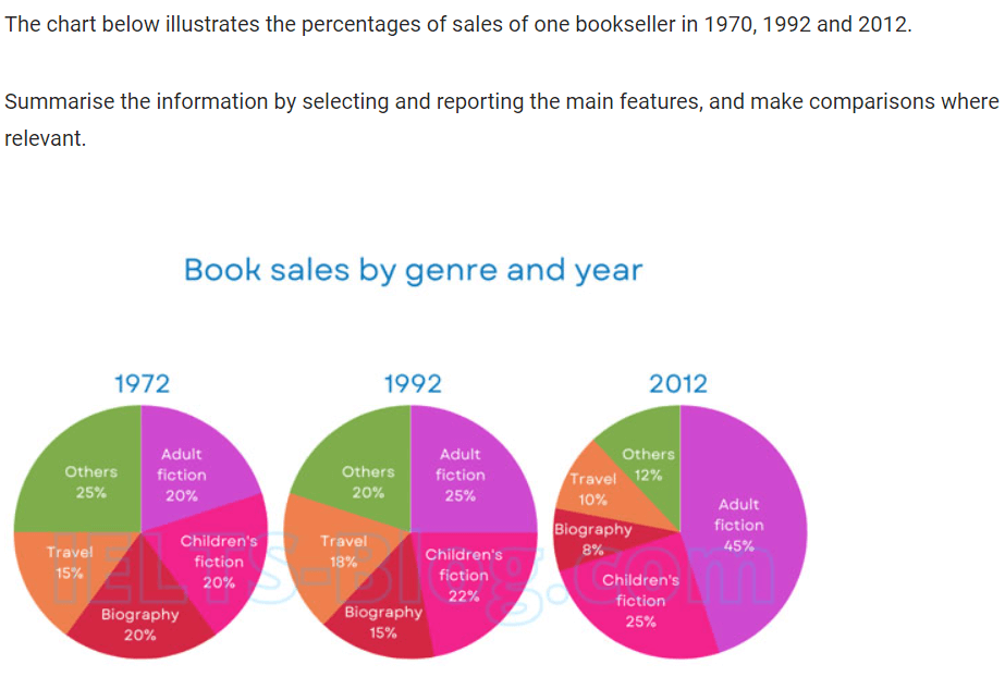
The bar chart demonstrates the proportion of sales of a bookseller in three different periods, in 1972, 1992 and 2012.
Overall, although there were almost the same percentage in sales of five various books, it showed some increase and decreases during the given period. In the final year the most consumable type of book among people was adult fiction, while the least was biography.
In relation to adult fiction books, it initially contained a fifth of book sales in 1972 before increasing moderately to a quarter by 1992, reaching its high peak of 45 per cent in 2012. Similarly, in 1972, children’s fiction books sold with the percentage similar to that of biography and adult fiction books.
In 1972, the proportion of selling biography books was 20% before decreasing by 5% after 20 years, finally ending with 8% of sales in 2012. Likewise, the sales of selling other genres of books dropped gradually throughout the period, detailing 25% in 1972, 20% in 1992 and finally 12% in 2012. There were fluctuations in sales of travel books in three periods. It started with 15% of sales then rising slowly to 18% by 1992, and finishing with a tenth of sales in 2012.
by Zulharnai Kenesary
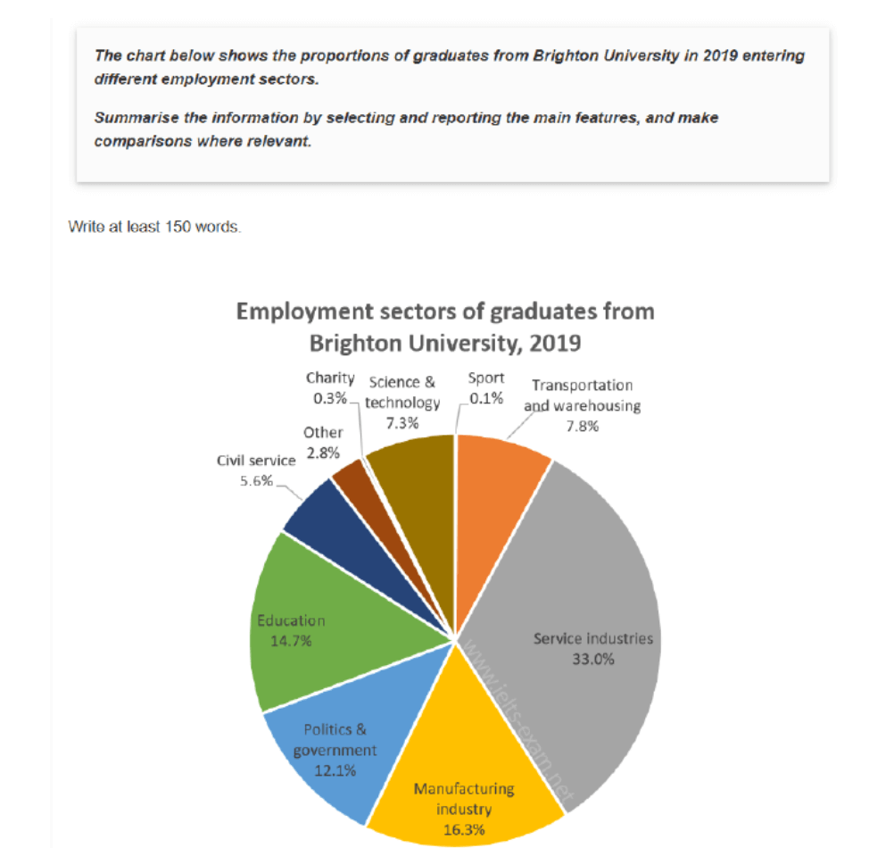
The pie chart illustrates how graduates from Brighton University were employed across various sectors in 2019, presenting in percentage for each sector.
Overall, the most popular entry sector for employment was service industries, with manufacturing industry and education in top three. Meanwhile charity and sport sectors demonstrated the smallest proportion of employees among graduates from Brighton University.
The highest employment rate was presented in service industry among Brighton University graduates, accounting for one third of the total. Manufacturing industry and education ranked within the top three, constituting 16.3% and 14.7%, respectively. Politics and government sector was also one of the popular choices, hiring 12.1 percent of graduates.
Transportation and warehousing made up for 7.8% of employment rate, having approximately similar trend with science and technology, which accounted for 7.3% of new workers. Whereas civil service and other sectors had lower representation with slightly differences at 5.6 and 2.8 accordingly. The charity (0.3%) and sport (0.1%) sectors had the lowest percentage of employed graduates from Brighton University.
by Adina
The graphs depict the agricultural output in two distinct regions of the nation.
Overall, the Eastern region yields a greater quantity of vegetables and dairy products, whereas the Western region predominantly cultivates more grains. Both regions generate an equivalent amount of meat.
Based on the provided data, grain cultivation stands out as the primary sector of agriculture in the Western Region-it constitutes almost a half of the total. Another half of the production is allocated between dairy 15% and meat 35%. Vegetable cultivation represents a negligible portion, comprising only one-twentieth of the total.
Meanwhile, the Eastern Region specializes in livestock farming, with meat and dairy together making up 65% of its agricultural production. This region produces a significantly larger quantity of vegetables, which accounts for one-fifth of the total, but fewer grains 15% compared to the Western Region. The proportion of meat production is equivalent to that of the Western region 35%.
by Alina Kairbekova