
IELTS WT1 (Bar)
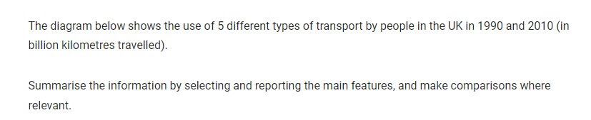
The graph gives data about how many kilometers the UK citizens travelled in 1990 and 2010 in relation to five various groups of vehicles.
Overall, travelling by bicycle, motorbike and bus became more popular in 20 years, meanwhile driving by train and airplane showed the opposite trend.
In 1990, the number of kilometers driven by bicycle, motorbike and bus was about 20, 40 and 80 billion respectively. However, in 2010 the number of kilometers travelled by bicycle almost doubled and reached approximately 30 billion. People who travelled by bus in 2010 used it more often than in 1990, which is about by 25 billion kilometers. The number of kilometers went by motorbikes increased steadily from about 40 to 45 billion over 20 years.
In comparison, the number of kilometers travelled by train decreased by 20 billion and reached approximately 80 billion. Air vehicles usage declined slightly from about 15 billion to 10 billion over the span.
by Daniya Bekentaeva
The graph below shows the average daily sales of selected food items at the Brisk Café, by season. Summarize the information by selecting and reporting the main features, and make comparisons where relevant.
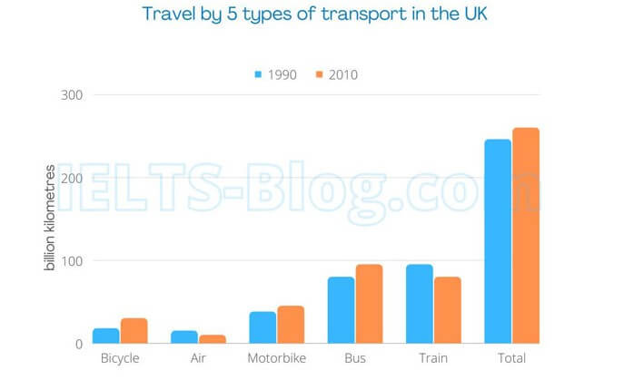
The bar graph illustrates the information about the average for everyday sales by number of various servings items such as hot coffee, iced coffee, ice cream, soup and salad at the Brisk cafe during the summer and winter seasons.
Overall, regular sales of hot coffee constituted a major in the winter where iced coffee in the summer; contrarily, iced coffee sold least in the winter and hot one in the summer. Althouth significant variations can be noticed in the selling of all food items over the seasons, salad sales in both seasons remained stable.
It can be seen from the information that during the winter, hot coffee was the most popular at the Brisk cafe for daily selling which accounted at three-quarter (75) whilst it declined sharply and reached at three in ten in the summer. In contrast, a negligible amount (1) of iced coffee was sold by the Brisk cafe between the winter. Interestingly, a drastic increase had been experienced in the daily sales of iced coffee during the summer which noticed at two-fifth of the total sale.
The graph further proves that the proportion of salad food’s everyday sales remained relatively constant in both seasons at a quarter. Furthermore, the soup which was sold in the Brisk cafe everyday had accounted at double (a half) in the winter rather than in the summer which was at 25. Lastly, average of regular sales of ice cream at the Brisk cafe was found a more than third (35) in the summer as well as 25 during the winter.
by Bekassyl Adenov
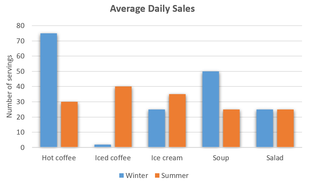
The bar chart demonstrates the percental data of the population in Iceland in relation to the age group from 1990 to 2020.
Overall, the percentage of population in young people decreased slightly over the period, while the proportion of older people increased.
The percentage of people between 25 and 54 was above 30% in 1990 and then this figure moved up consistently to reach its highest point of under 50% in 2020. For age group 65 and over, it began the given period with a tenth of total population, showing small changes to stay around 13% of population at the end of the period.
In terms of children under 14 years, its proportion represented around 25% in 1990, before declining moderately to hit its low of about 19% 3 decades later. Similarly, for youngsters from 15 to 24, the trend experienced a slight drop, beginning at above 20% in 1990 and ending the period with under 10% in 2020. The percentage of age group 55-64 fell continuously to reach around 10% in the last year.
by Zulharnai Kenesary
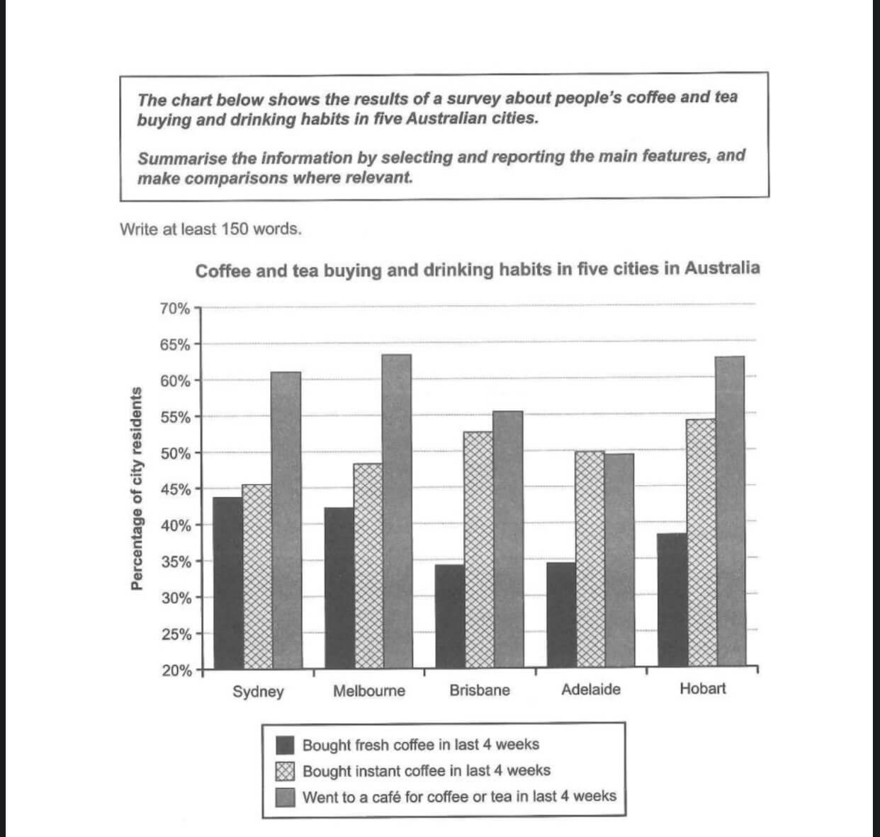
The bar chart shows the information about the consumption of coffee and tea in four Australian cities.
Overall, the graph shows that Australians preferred visiting cafe for coffee or tea quite often, followed by buying instant coffee, while the percentage of purchasing fresh coffee to go was the least popular option.
The majority of consumers went to a cafe to drink coffee or tea in the last 4 weeks. This trend is similar in Melbourne and Hobart with approximately 63 percent of residents who chose to drink, while Sidney and Brisbane had just over 60 and 55 percent of people going there, respectively. However, in Adelaide buying an instant coffee is the most popular option, with 50 percent of people choosing it over fresh coffee, which is about 34 percent.
Meanwhile, the percentage of buying fresh coffee remains the least popular among Australians. Sidney and Melbourne appear to be the cities with the highest percentage of consumers purchasing fresh coffee with 44 and 43 percent of people buying it, accordingly. Brisbane and Adelaide where the cities with the least number of fresh coffee consumers with nearly 33 percent of people buying it in the last four weeks.
by Adina Zhorobekova